View
stories

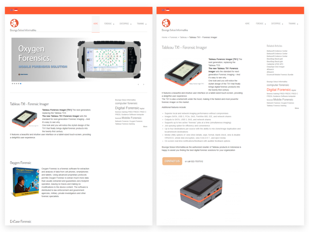
Reimagining and Advancing Digital Forensics Bounga.ID Website

Years:
2021
Platforms:
Mobile
Deliverables:
Design, Research
ui ux portfolio Redesign Web 4
ui ux portfolio Redesign Web

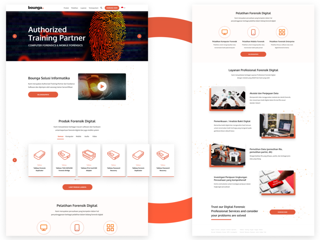
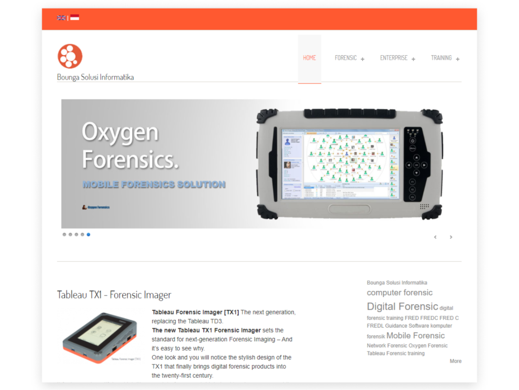
Kami didekati oleh Bounga.ID, Konsultan Forensik Digital, untuk mengubah situs web mereka yang sudah ada. Mereka benar-benar fokus pada keamanan untuk situs web baru. Dari sesi wawancara pemangku kepentingan, kami menemukan bahwa kebutuhan mereka pada dasarnya adalah memperbarui penampilan mereka secara keseluruhan agar lebih menarik bagi pelanggan mereka.

Background

About Bounga

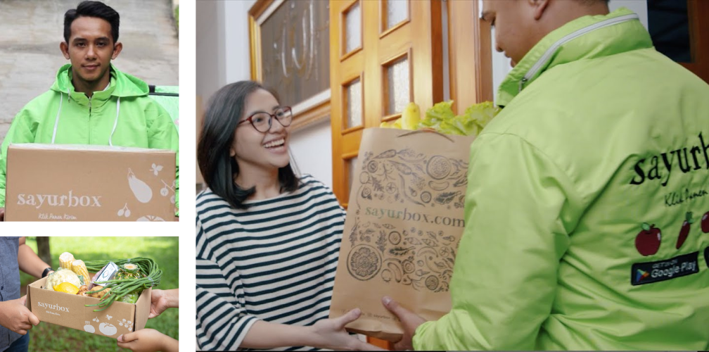
Sayurbox is a platform that focuses on delivering fresh quality raw food (vegetables, fruit, meat, etc.) delivered directly to consumers’ doorsteps at affordable prices with raw materials obtained directly from local farmers.
The company had remarkable growth in the previous years and was then contemplating the expansion of its mobile app services. SayurBox had planned to launch two new features; an Instant Delivery Feature and a native Referral Program, with the intention of drawing more customers and boosting engagement. The objective was to enhance the user experience and augment user acquisition and retention.

Challenges

Adapts to Customer Need

The existing same-day delivery feature was not sufficient to meet customer demands and expectations. Customers were looking for faster delivery times and were willing to choose competitors who could provide 2-3 hour delivery. As a result, Sayurbox needed to find a way to offer instant delivery to remain competitive and meet customer expectations.
SayurBox has implemented a referral program before as part of its growth strategy to expand its user base, but it did not yield significant conversions. Currently, the referral program is managed through a third-party platform. To address this, SayurBox planned to develop a native referral program aligned with the unique user needs to increase the number of conversions.

Goals

Fast Delivery, Better Referrals

The instant delivery feature aims to provide consumers with fast and convenient access to the fresh food. Through these needs, we try to create an intuitive UI and ease of access.
For Referral Program feature, the aim is to improve user acquisition and retention. We try to design a better referral program based on users needs to increase the program effectiveness in driving conversions.

Process

Design Process for Excellent

We explored user needs, preferences, and pain points through secondary research, in-depth interviews, and online surveys, to helped us identifying key requirements for the new features.

Using discovery insights, we designed new feature interfaces and entry points. Moreover, we conducted in-house feedback sessions to ensure alignment with the company’s vision.

We tested the new features with group of target users in realistic scenarios to observe their interactions.

Feedback from usability testing informs iterative design improvements until desired user experience is achieved.

Features

Existing Design

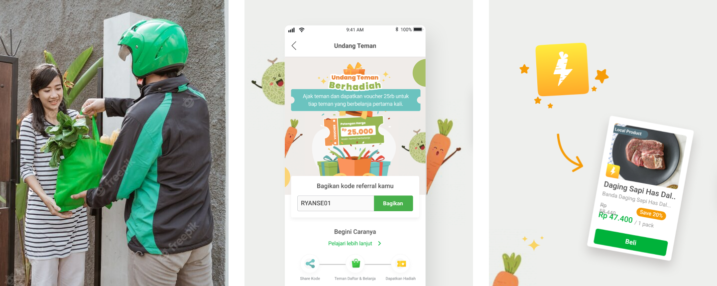
In order to bring a seamless and delightful instant delivery experience, we have integrated multiple entry points so users could discover feature easily in different edge case . The page will showcase available instant delivery products with prices and delivery times. With just a few taps, users can quickly select the desired items and place their order, all within a matter of seconds.

ui ux portfolio Redesign Web 2
ui ux portfolio Redesign Web 1

Revamped New Design

To improve the referral program, we created a new flow and reward scheme for users that would be attractive enough to incentivize them to participate. We incorporated findings from the research phase to ensure that the program meet the needs and preferences of our users.
Adhering to Jakob’s Law, which emphasizes that users find it easier to learn and adapt to familiar design patterns from other mobile apps, we added a new list on the profile page that could be easily accessed through the navigation menu, leading users to a dedicated referral page. This feature enabled users to receive a unique referral code that they could share with their network.

ui ux portfolio Redesign Web 4
Results

The Project Runs Smoothly

We conducted usability testing, the results of which can be viewed below. By analyzing user behavior and feedback, we were able to make data-driven decisions and implement improvements that ensure a more intuitive and satisfying user experience.

Fixed consistency & usability issues
Participant loves with Instant delivery feature
On Referrals program, participant tend to faced no difficulity
Testimonials

Tim nya ramah dan professional

“Personally seneng banget sih kerja bareng kalian, karena design maturitynya udah okee, jadi ga butuh banyak effort lagi, tinggal jelasin projectnya aja”

ROBERTHA DAYU
Senior Product Designer, Sayurbox

Let’s do something great together